Explore any of my design projects below to read about each learning journey.

I audited the Tiong Bahru Bakery website to rethink its design and presented my proposed concepts through iterative prototypes.
As a team, we targeted the problem space of a specific user group to propose and iterate on the design of a video conferencing platform.

I identified a problem space in users’ gifting needs to address via proposing a new mobile interaction design.

#userinterface #mobiledesign
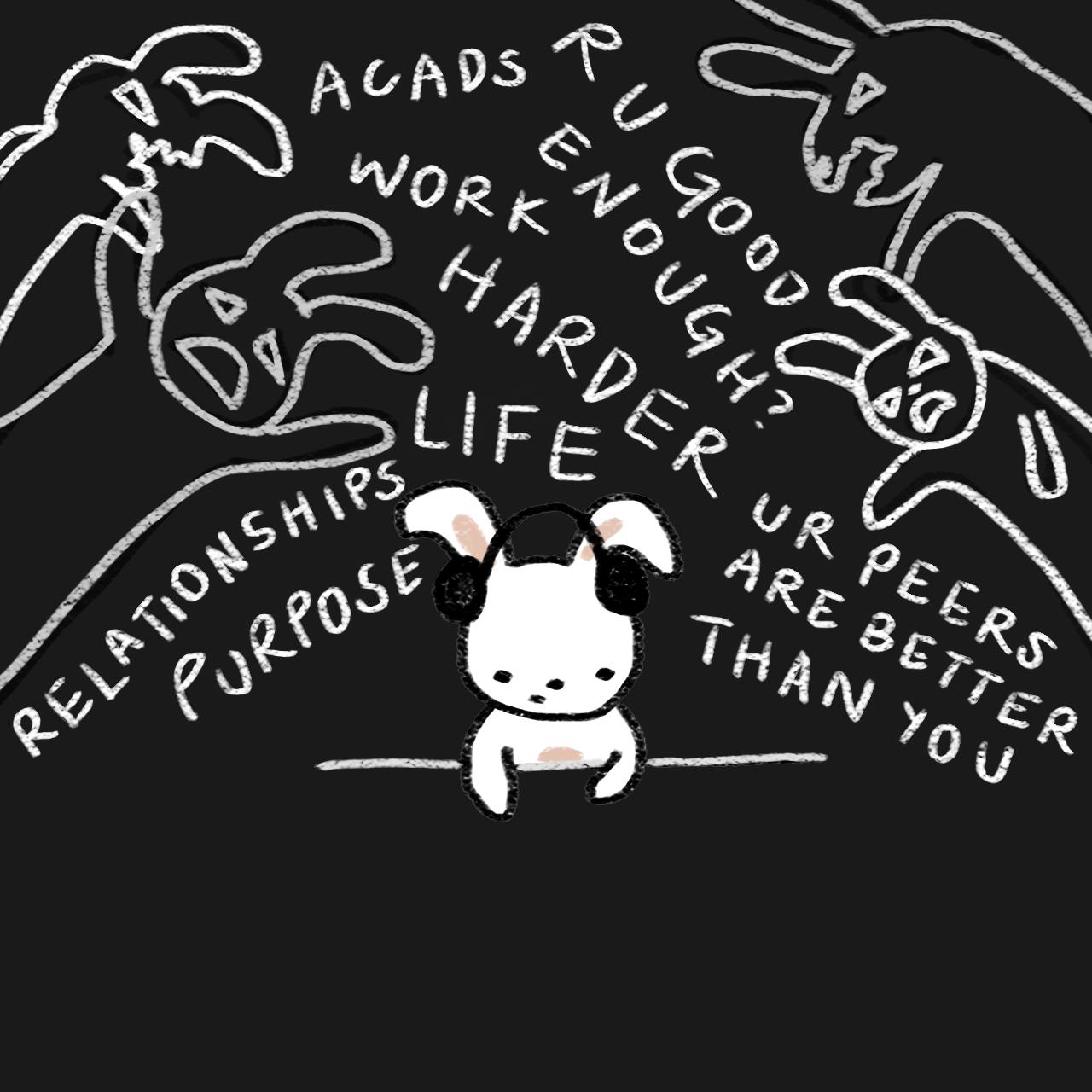
Gifting is a popular, and typically enjoyable, way for people to express their feelings towards others. However, complexities in its process and varying contexts can give rise to negative experiences. Through a data-driven process, I identified a problem space in users’ gifting needs to address via proposing a new mobile interaction design.
Through design thinking processes — ideation, problem definition, user testing, prototyping, evaluation, and iteration — I developed a hi-fi prototype of the mobile app: “For You”. It endeavours to create a more personal and enjoyable gifting experience for both gift-givers and receivers.
Duration: 6 weeks
Tools: Figma, Miro
Stages: Initial design proposal, lo-fi wireframes, mid-fi prototype, hi-fi prototype
In this project, I attempted to iteratively redesign certain elements of the Tiong Bahru Bakery website based on the hypotheses that I had developed.
(Lazy to read? Here's a summary video where I explain my process: YouTube)
Website Audit
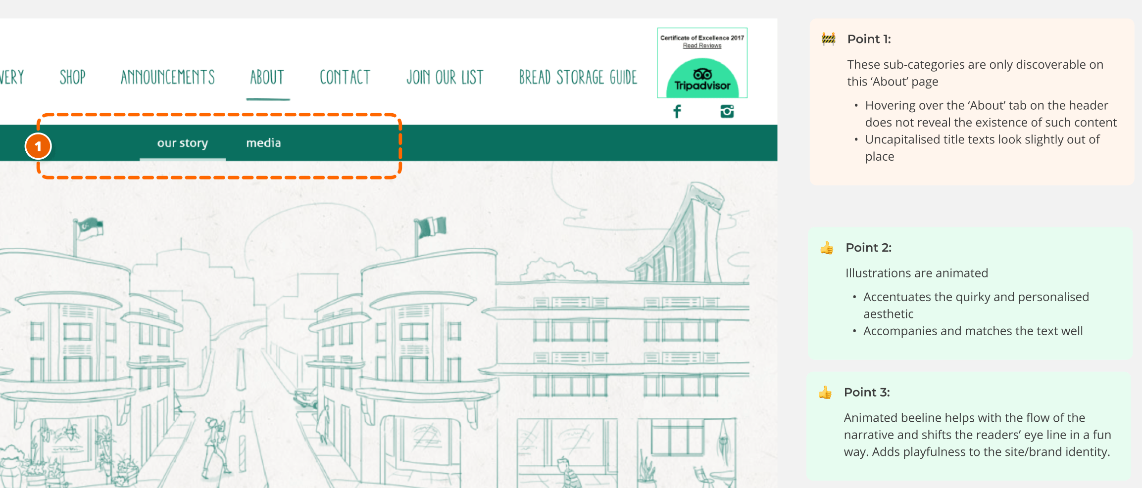
I began by conducting a detailed audit of the Tiong Bahru Bakery (TBB) website, highlighting the positives and negatives (areas for improvement). This laid the foundation for my next course of action: sieve out hypotheses that I saw potential in working on. I tried to mitigate my personal biases and preferences by thinking about best practices when conducting my audit.
Aside: Why TBB's website?I underwent a thorough consideration process to decide on what service experience I was interested in breaking down and redesigning. Going off my personal interests, I contemplated between the websites of Letterboxd, Criterion Channel, Y8.com and more. I even completed a detailed (and painful) audit of the Y8.com website. However, I eventually pivoted and selected the TBB website due to its interesting user journeys with high potential for redesign, and my level of access to its target audiences (for user testing needs).
Developing Hypotheses and Concepts
I took observations and pain points and turned them into hypotheses. Ultimately, I crafted and favoured the following hypothesis:
Because we think that the power of stories in interesting product descriptions is true we think providing short but distinct narratives for each product’s description will mean customers can learn about specific stories that make each product a unique experience and hence make purchasing choices based on the emotions that they hope to feel through the consumption of these products. We’ll know that this is true/false when we see people are able to distinguish between products and they take the time to read through these narrative-based descriptions before choosing what to purchase.
Supporting this hypothesis were key concepts that I wished to test through prototyped flows:

Testing My Hypotheses
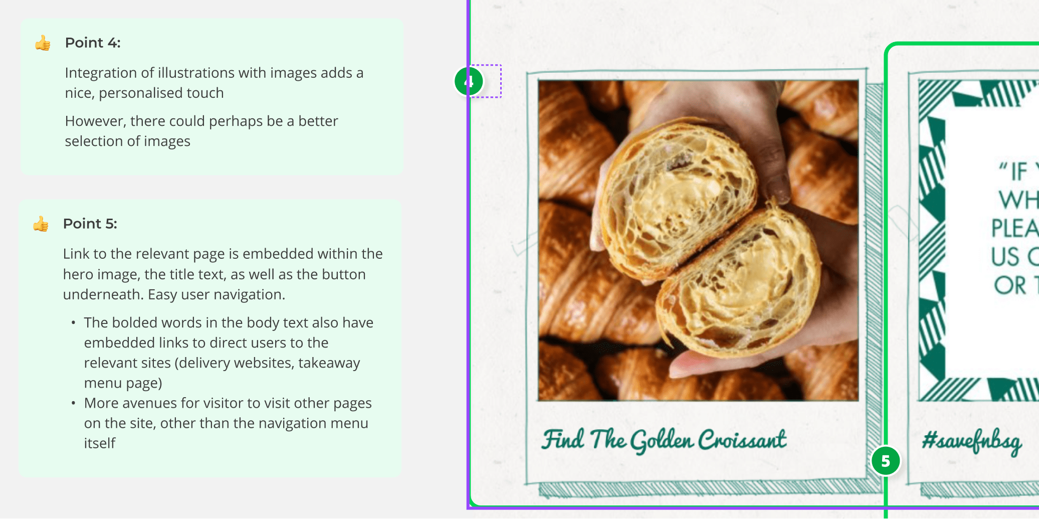
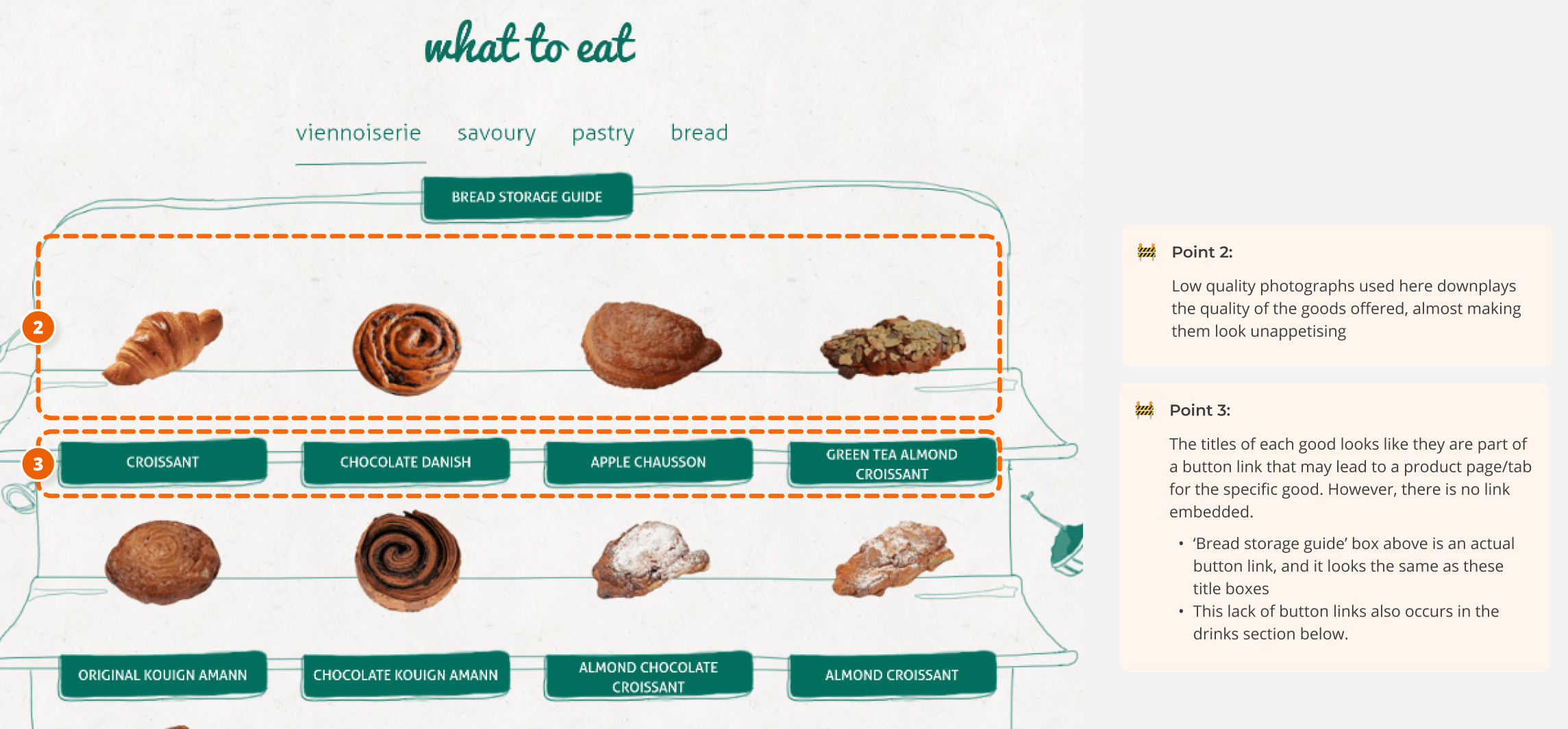
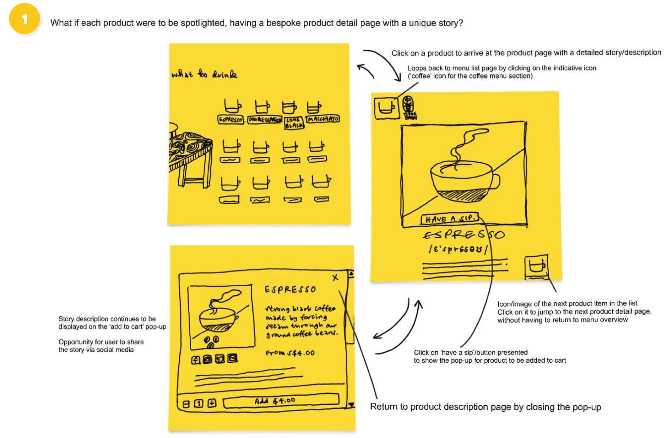
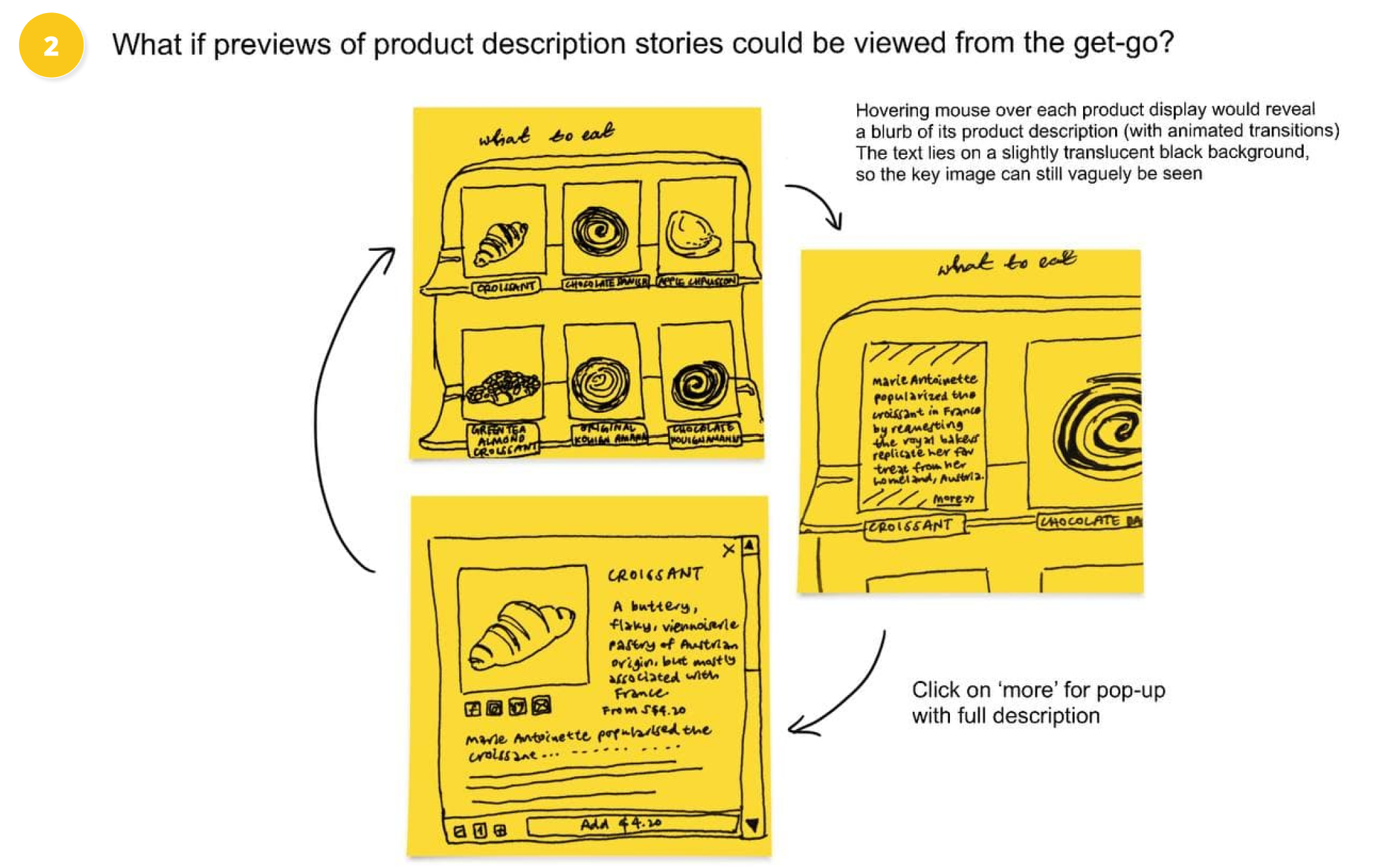
I prototyped elements such as product pages, pop up hovers, illustrations and even a unique review system. While aligning my prototypes tightly to the core brand identity and aesthetic, I also aimed to elevate the neighbourhood-ly feel of the bakery. Hence, I was most concerned with the textual storytelling components as well as the UX writing, focusing on good and interesting use of language. (My initial prototype can be found in my Figma file, here).
My identified target audience for user testing was 13 to 26 years old locals who were familiar with TBB, and patronised online stores. When crafting my discussion guide, it was important to understand their perceptions of the brand, as well as their values and behaviours in using online retail platforms. View my discussion guide here. I also drafted a plan for my interviews, which included a list of potential interviewees and their profiles, a list of requirements for eligible users, the details of my testing plan (location, time, duration, mode), and how I planned to document each session.

I replaced the previous product images with more high-definition, lively photos of the same products, but retained the layout of the online display. By adding an overlay that would appear upon a mouse hover, I sought to bring forward the product's narrative (description), allowing for users to chance upon it more easily, and pique interest.
User Interviews and Synthesis
I tasked my interviewees to try and complete a purchase on my prototyped redesign of TBB's online retail website. I instructed them to use the think-aloud method to articulate their thoughts every step of the way. I managed to interview three users that varied in their familiarity with the TBB brand identity, and the amount of experience they had with the online retail platform. I adopted the use of voice recordings (after consent was granted) which I later transcribed for documentation purposes—this was the most effective method as I conducted the interviews solo.
I synthesised my findings by pulling out key quotes and bucketing them under identified themes and patterns. I then sieved out common patterns to develop my key insights. For example, I found that people valued convenience and easy viewing of descriptions. Check out my Miro board to fully understand how I synthesised my findings!
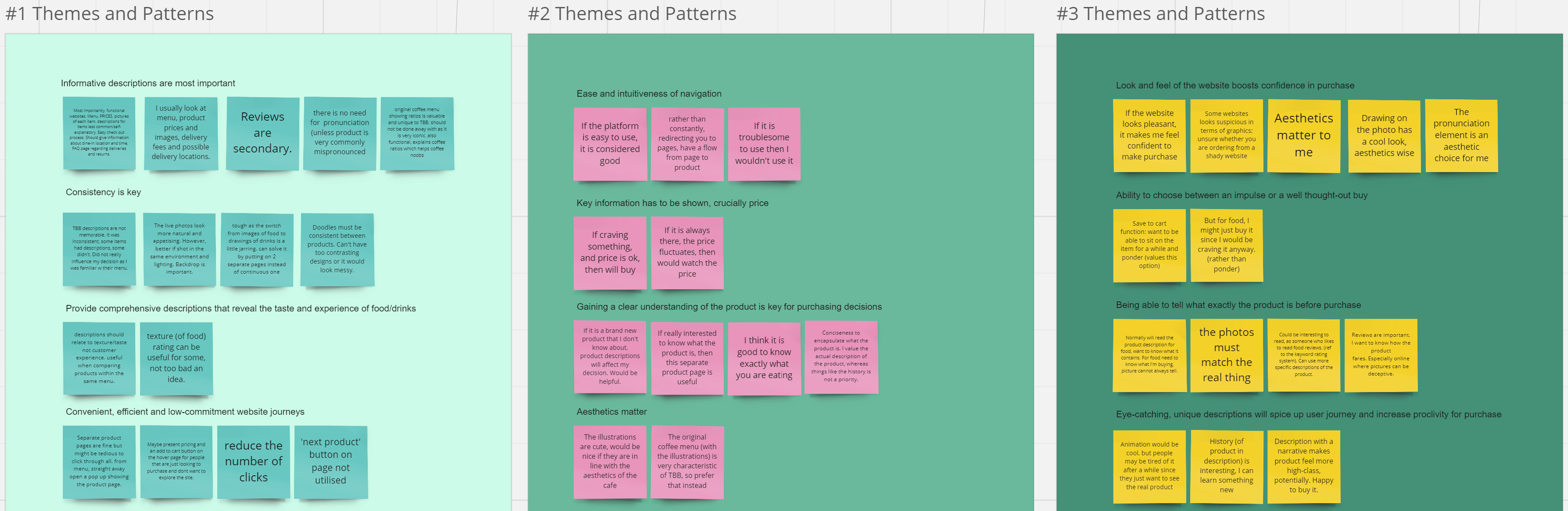
Quotes (sticky notes) were sorted into identified themes/patterns.

1 (of 5) key insights developed
Second Iteration
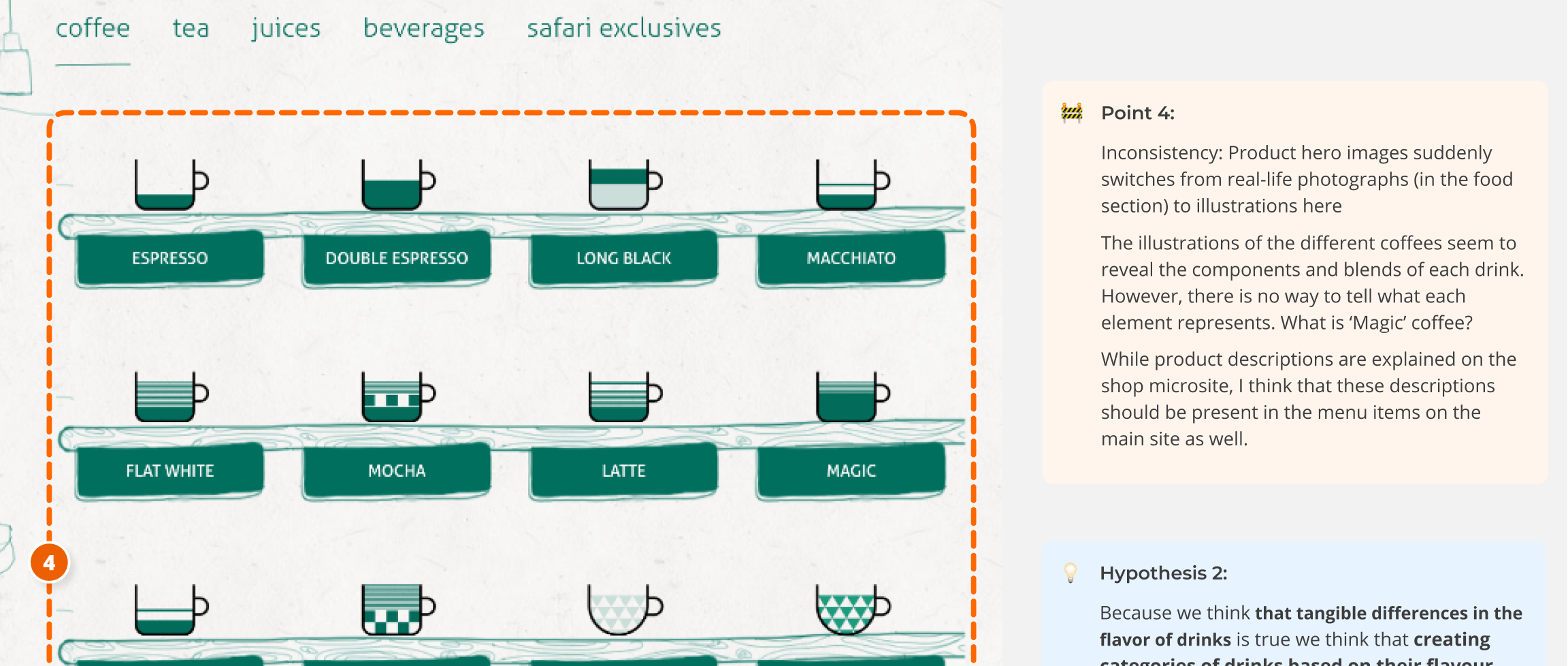
I focused on refining my concepts according to previous feedback. I reverted back to the illustrated coffee menu as part of the importance of brand identity, but clarified the different coffee components. I also maximised the use of pop ups and hovers in accordance with the users’ need for convenience and ease of navigation.
To test out my redesign, I sought out interviewees who were unfamiliar with the brand, leveraging on fresh perspectives to purely test out my concepts. I brought my interviewees down to physical outlets to understand their immediate ideas about the brand.
This time, I received very direct and targeted feedback, as well as fresh insights, as anticipated. Synthesising my learnings again, I found that a few of my insights sounded like a refined version of my older insights. I also developed new and unexpected ones, such as the need for signposting.
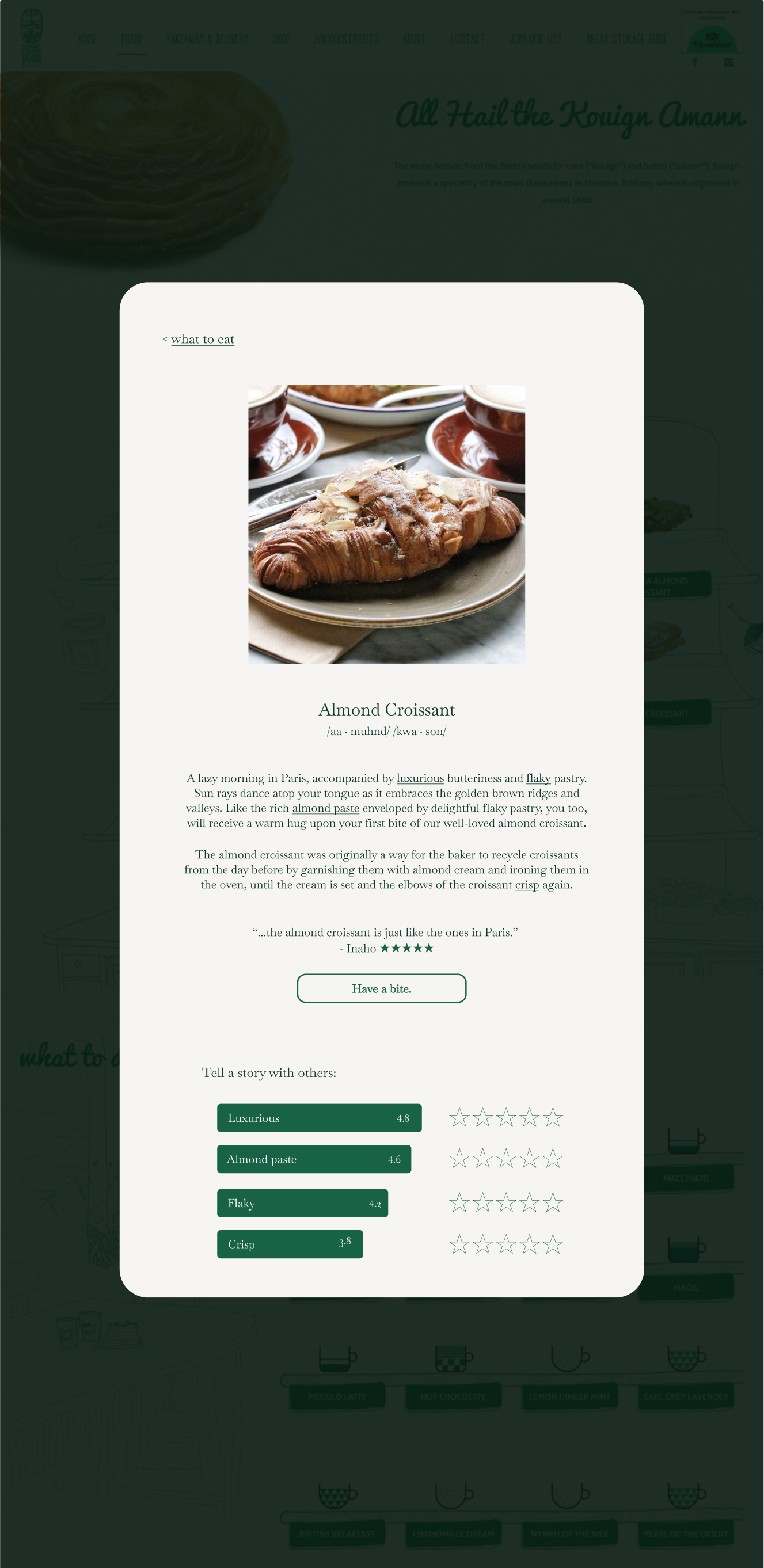
A redesigned screen including multiple new key insights that I tested with users.
Moving Forward
I would target the quick wins and pain points identified. I would then restructure my concepts, such as clarifying product details upfront and ensuring a smooth user journey, such that users naturally gravitate to appreciate the stories on display. These are a few of the many things to think about, as the iterative design process is a continuous one.
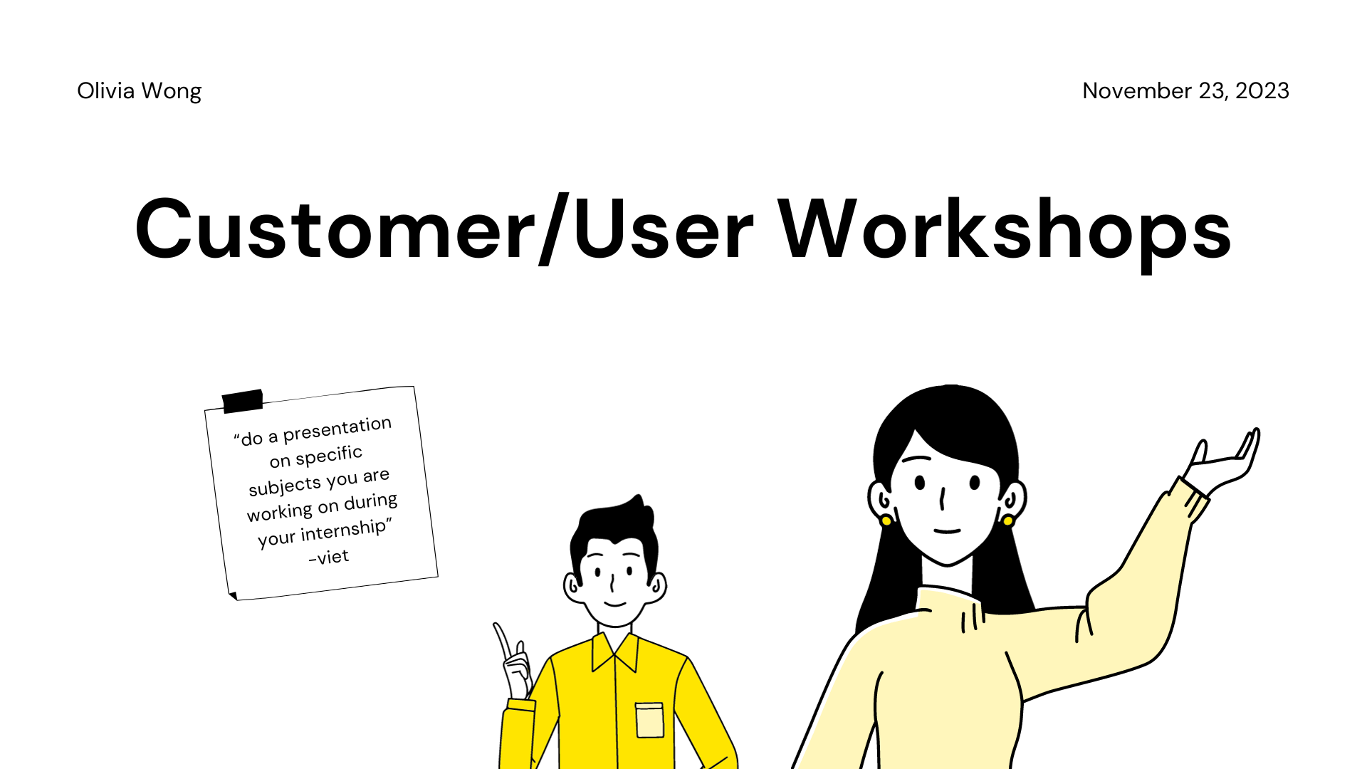
As a design team, we identified a specific user group who could benefit from a carefully targeted design for a desktop video conferencing system, and proposed a design to meet this user group's needs.
Target Users and Problem Space
We identified two groups of users: teachers and students of the National University of Singapore (NUS). This decision was made after consideration of the prevalence of online tutorials and lectures in NUS, especially after the recent Covid-19 pandemic.
After brainstorming, we broadly identified the problem to be a lack of effective engagement between teachers and students in online classes, hosted on video conferencing platforms.
To better understand this problem, we further broke it down into four specific sub-problems:
1. Lack of built-in tools for in-class engagement with students e.g. extensive polls, kahoot-style
2. Lack of built-in tools for students to raise questions to teacher
3. Teacher feels like they’re just talking into a screen
4. Screen not shared/Teacher muted situation
We analysed three other frequently used online learning/video conferencing platforms (Zoom, Archipelago, Gather.town) to gain a better understanding of the systems in place, and identify pain points or areas to target our design.
Data Gathering
After a few discussions and iterations, we refined our data gathering plan and crafted key questions for our two target user groups:

We decided that using different data gathering techniques for each user group would be most effective (based on intended sample size, characteristics of users, question type):

Data Analysis
The main question that we needed to answer about our target user group and their current practice was: ‘Is there a demand for more effective engagement tools within video-conferencing platforms during online classes? Why or why not?’
We found that the answer to our question differed depending on the type of class, and the extent of the demand for effective engagement tools varied depending on the type of users and their motivations. Effective engagement was considered highly important for seminar or tutorial-style classes, but less crucial for lectures. The most important thing that we discovered was arguably that there was a strong need for ease and clarity. From our interviews, all of our interviewed teachers have had experiences with screen-sharing issues, or forgetting to unmute as a result of uncertainty in using the interface. We also concluded from our questionnaire that while there is a significant demand for greater effective engagement during online classes, students still wish to have the freedom of choice when it comes to privacy and comfort e.g. unmuting, switching on camera.
Requirements Definition
We developed personas based on our user research and data gathered.


Two basic user personas to represent the teachers and students, respectively.
To move from data to design, we wrote scenarios for our user personas. This provided us with more vivid details off which we could base our design proposal. We crafted a current scenario to illustrate the frustrations that our users were facing, and then a proposed scenario to envision our users' future experience with our designed system. Here is an excerpt from our “current scenario":
Professor Henry joins one of the breakout room groups to check on them, but no one seems to be talking. [...] In the middle of the conversation, he is interrupted by a popup from Xiao Ming’s group requesting help and so cuts short the discussion and joins Xiao Ming’s breakout room. However, while explaining the task to Xiao Ming’s breakout room, his thoughts are again interrupted with another pop up from the other group.
And an excerpt from our “proposed scenario":
With the poll options in the toolbar, he can now set up a custom poll on the go to check on the students' progress while he waits for more students to join the online class. As students enter the call, they appear as avatars that can roam around the virtual classroom space. Meanwhile, Professor Henry positions his avatar at the front of the classroom, and there is a notification on his virtual front desk for students to open and complete the new poll.
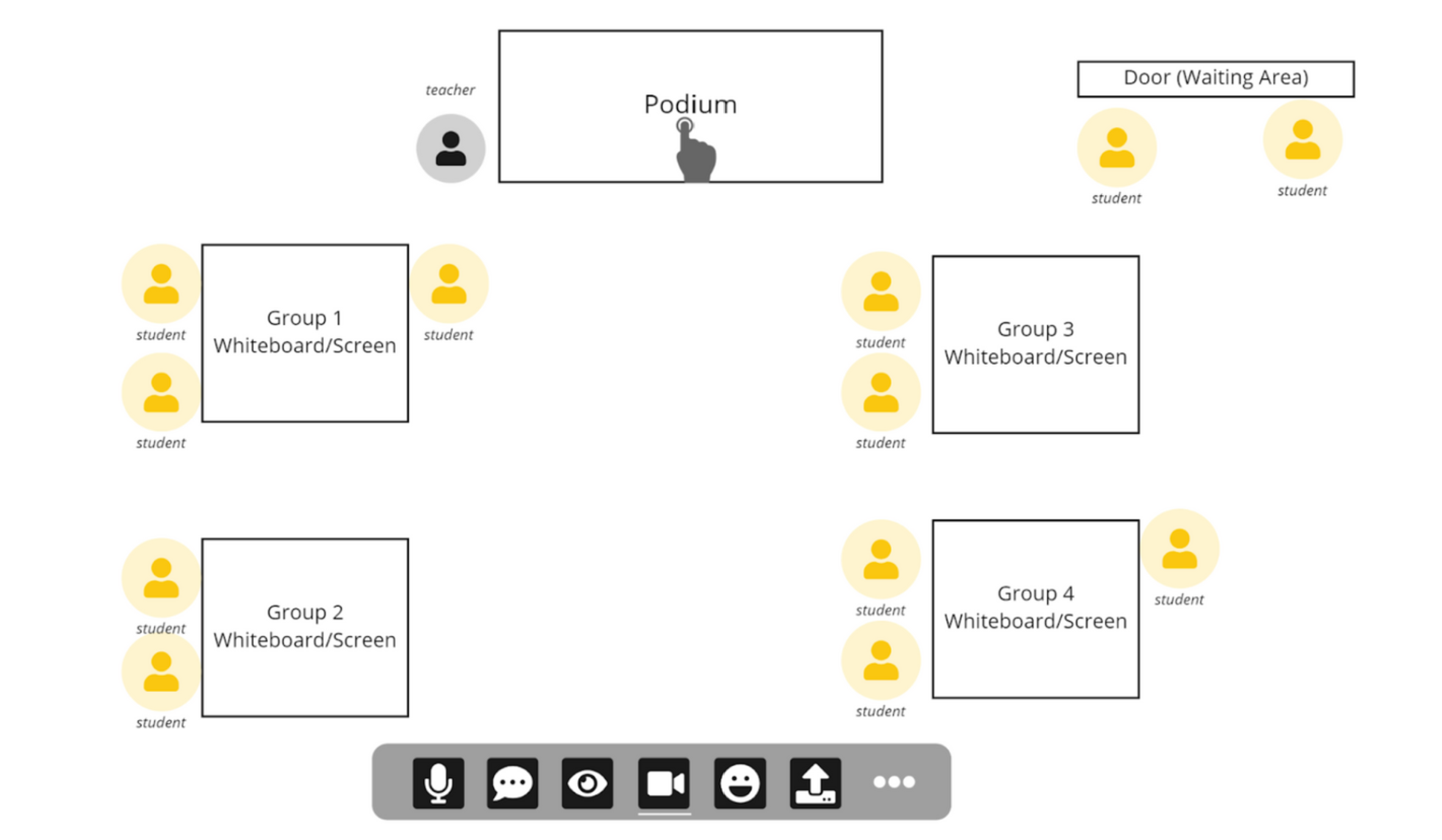
Conceptual Design and Prototype
We storyboarded our design via lo-fidelity (lo-fi) sketches, before developing lo-fi mockups of our prototype on Miro. As the focus of this project lay in the process and UX considerations, we did not do any mid/hi-fi prototyping, instead focusing on conveying our ideas effectively via a suitable prototype and flow.

Sketched storyboard to illustrate our concepts.

The main landing screen designed for our video conferencing system.
User Testing
We focused on testing with teachers (n=4), instructing them to carry out a series of tasks that would mimic the flow of a single lesson, while thinking aloud. We followed up each session with a post-test interview to clarify our understanding of the user's test experience and ask further questions relevant to our design proposal.
Through comprehensive user testing and insights gathering, we identified the most salient issues in our interface design. This allowed us to proceed with redesigning efforts that were informed by our user's needs and behaviours.

We sieved out the issues faced by our users during testing, and developed a redesign proposal to tackle these specific frustrations.
Redesign and Heuristic Evaluation
Upon completion our redesigned prototype, we conducted a heuristic evaluation (using Jacob Nielson’s 10 Usability Heuristics). This was useful for identifying potential problems with the redesign, especially since we did not have the time and resources to conduct further usability studies. Our heuristic evaluation revealed that there were areas for further refinements (e.g. greater clarity on what the user's screen’s view is vs. where their avatar is actually located). Furthermore, if granted more time, we would rethink our conceptual model, in terms of areas that have led to greater confusion (as identified in the heuristic evaluation report).
From simple graphic design to amateur illustrations, the following works illustrate my ongoing learning process.

These 72 pages were designed for print. The resultant book is an embodiment of my design learning journey: working with the Adobe suite for the first time, and applying visual literacy concepts.
View the e-book here.
My Instagram art account @crispy__art, where I document my art process, no matter how unpolished the work is.

I co-designed this yearbook using Canva (only selected pages displayed)
Comic strips that I illustrated for @nusresidentiallife. Scroll through the older posts (before May 2023) to find my full comics!
-min.png)
Digitally illustrated shirt designs for a sports group.
Design of presentation slides.

Video logs of my life and travels, produced on YouTube to document precious memories.
.png)
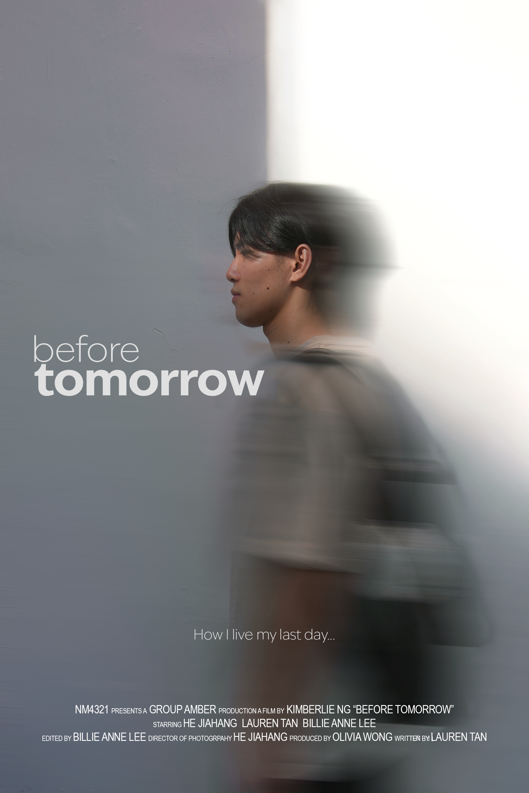
I was the primary editor and secondary director of photography for this short documentary on Fossasia